V-Calendar
A lightweight, dependency-free plugin for building attributed calendars in Vue.js
V-Calendar is a clean and lightweight plugin for displaying simple, attributed calendars in Vue.js.
Calendar
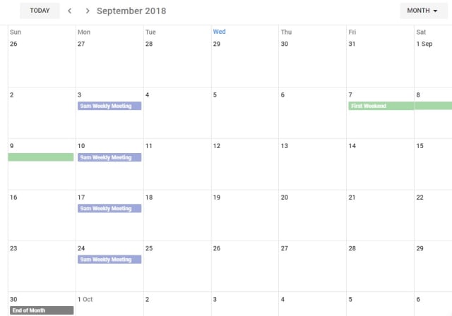
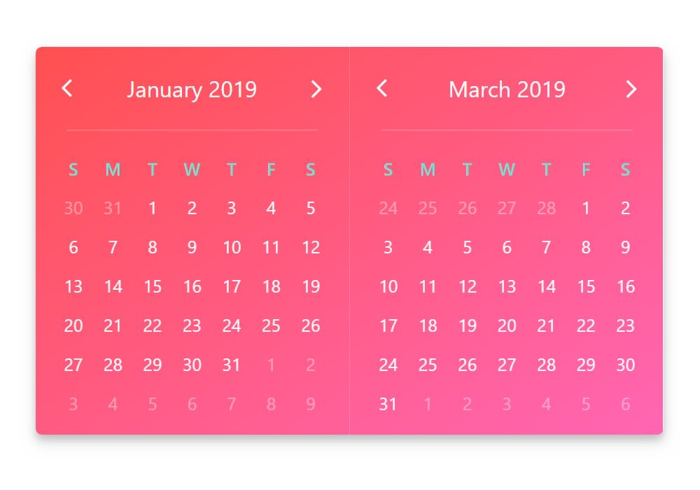
v-calendar is the core component. By default, it has a neutral design that should blend nicely within any web application, with various options for configuring the basic layout:
- Single or double paned
- Can be expanded to fill the width of its container
- Header title can be left, right or center-aligned
- Slot support for custom header and header subcomponents
- Navigation transitions (horizontal slide, vertical slide, fade)
Along with the calendar panes, v-calendar employs a semantic-inspired navigation pane when the header title is hovered or focused by the user.
Date Picker
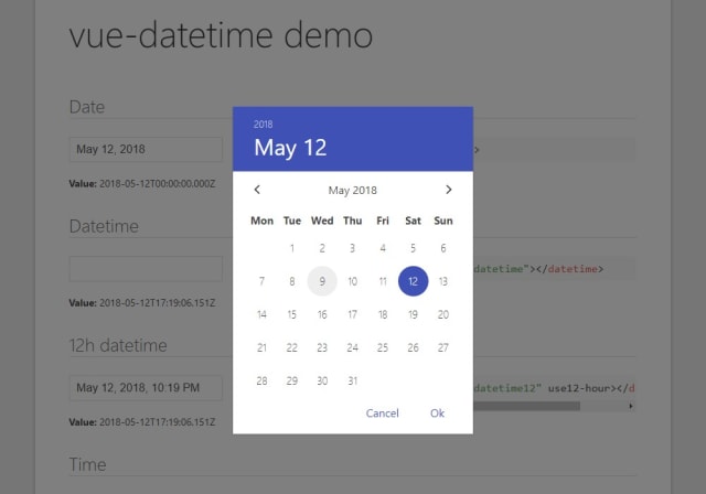
The v-date-picker component is a flexible date picker component wrapper around v-calendar, which means it supports all props and events that v-calendar does. Using the mode prop, it is capable of 3 selection modes:
- Single dates
- Multiple dates
- Date ranges
Date pickers can be displayed inline or as a popover for an input element which can be classed or styled
<v-date-picker
    mode='range'
    v-model='selectedDate'
    show-caps>
</v-date-picker>
export default {
data() {
return {
selectedDate: {
start: new Date(2018, 0, 9),
end: new Date(2018, 0, 18)
}
};
},
};Also, a custom slot element can be used to display your own input element. This example uses Buefy for a custom styled input component.
<v-date-picker
                                    mode='single'
                                    v-model='selectedDate'>
  <b-field :type='inputState.type' slot-scope='props'>
    <b-input
            type='text'
            icon='calendar'
            :value='props.inputValue'
            :placeholder='inputState.message'
            @change.native='props.updateValue($event.target.value)'
            expanded>
    </b-input>
    <p
            class='control'
            v-if='selectedValue'>
      <a
              :class='["button", inputState.type]'
              @click='selectedValue = null'>
        Clear
      </a>
    </p>
  </b-field>
</v-date-picker>
export default {
data() {
return {
selectedDate: new Date(2018, 0, 10)
};
},
computed: {
inputState() {
if (!this.selectedValue) {
return {
type: 'is-danger',
message: 'Date required.',
};
}
return {
type: 'is-primary',
message: '',
};
},
},
};